Gantt Chart is a chart where activities are visible through a timeline so that anyone can understand about an specific task about when the task was starts and when it finished. More clearly it can be said that, in a Project you need to monitor the activities of each task. To monitor in a better way you can create a Gantt Chart where every tasks shows their status through a timeline. Usually this chart uses Horizontal Bar to show the values.
This chart was first introduced by Henry Gantt in 1910. In most of the company MIS Executives are using Gantt Chart for launching new products in the market. It is very important that, managing a project of launching new product in the market due to there are huge competitors. And every task within this launching project need to monitor very deeply.

How to create Gantt Chart?
Step 1:
Create a Table that shows Project Tasks. Before creating the chart list each task in your project with start date and approximate ending date. Remember you need to arrange the task as "First Task in the Project Comes First". Otherwise your Gantt Chart will become complex to understand. I have listed a table as below:

Step 2:
This chart was first introduced by Henry Gantt in 1910. In most of the company MIS Executives are using Gantt Chart for launching new products in the market. It is very important that, managing a project of launching new product in the market due to there are huge competitors. And every task within this launching project need to monitor very deeply.

Image 1: Gantt Chart
How to create Gantt Chart?
Step 1:
Create a Table that shows Project Tasks. Before creating the chart list each task in your project with start date and approximate ending date. Remember you need to arrange the task as "First Task in the Project Comes First". Otherwise your Gantt Chart will become complex to understand. I have listed a table as below:

Image 2: Listing project tasks in a table
Step 2:
Create a 2D or 3D Stacked Bar Chart. Click anywhere in the Table and Click on Insert ➪ Charts ➪ Insert Bar Charts ➪ 2D Charts ➪ Stacked Bar from the top menu.

This will insert a Stacked Bar Chart like below:

Step 3:
Editing the chart data. Select the newly inserted 2D Stacked Bar Chart by clicking on it and Click on Design ➪ Select Data from Data group.

After clicking on it, you will see a dialog box named: Select Data Source as below:

Click the EndDate from Legend Entries (Series) list and Click on Remove to remove it and Click on Ok to complete chart data editing.

After deleting EndDate the chart will looks like this:

Step 4:
Chart formatting. Click the "StartDate Point" (blue bar in the chart) to Select all the Start Date Point like below:

Now Click on the Format menu and from Shape Styles group Click on Shape Fill ➪ No Fill. Again Click on the Format menu and from Shape Styles group Click on Shape Outline ➪ No Fill.

Now Click outside the chart anywhere to deselect the "StartDate Point". Now Right Click on Vertical Axis and Click on Format Axis.

This will activate the Format Axis Pan. Select Date Axis option from Axis type, Select At Maximum category from Horizontal axis crosses and Select Categories in Reverse Order option.

Click the DaysRequire Points in chart to select all the horizontal bars and apply the Intense Effect - Green ➪ Accent 6 color from Format menu. It will give a nice look.

Right Click again on DaysRequire horizontal and Click on Format Data Series. This will activate Format Data Series Pan. Select Series Options and set the Gap Width as 30%.

Select Chart Elements option and select the necessary options: Axes, Chart Title and from Grid lines option select Primary Major Vertical, Primary Major Horizontal, Primary Minor Vertical and Primary Minor Horizontal. You can also change the Text Alignment direction for horizontal axis and delete the Legend also can add a Chart Title.
Seems like some extra date is reading in the Horizontal Axis which has actually no value. Example 6-Nov-16 to 16-Dec-16 = 30 days. If we reduce the Horizontal Axis Minimum Bounds, then it will not count again.
Just Double Click on Horizontal (Value) Axis. Then a Format Axis window will appear. Set the Bounds from Axis Options as Maximum 42720 and Minimum 43835. It depends on your project starting date and overall project ending date and remember this date converted to number.

Finally your Gantt Chart will looks like this:


Image 3: Selecting 2D Stacked Bar Chart
This will insert a Stacked Bar Chart like below:

Image 4: 2D Stacked Bar Chart
Step 3:
Editing the chart data. Select the newly inserted 2D Stacked Bar Chart by clicking on it and Click on Design ➪ Select Data from Data group.

Image 5: Select Data
After clicking on it, you will see a dialog box named: Select Data Source as below:

Image 6: Select Data Source
Click the EndDate from Legend Entries (Series) list and Click on Remove to remove it and Click on Ok to complete chart data editing.

Image 7: After Removed the EndDate field
After deleting EndDate the chart will looks like this:

Image 8: EndDate removed
Step 4:
Chart formatting. Click the "StartDate Point" (blue bar in the chart) to Select all the Start Date Point like below:

Image 9: Select all the Start Dates in chart
Now Click on the Format menu and from Shape Styles group Click on Shape Fill ➪ No Fill. Again Click on the Format menu and from Shape Styles group Click on Shape Outline ➪ No Fill.

Image 10: After settting No Fill to Shape Fill and Shape Outline
Now Click outside the chart anywhere to deselect the "StartDate Point". Now Right Click on Vertical Axis and Click on Format Axis.

Image 11: Format Axis
This will activate the Format Axis Pan. Select Date Axis option from Axis type, Select At Maximum category from Horizontal axis crosses and Select Categories in Reverse Order option.
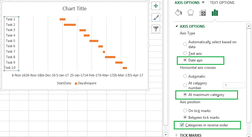
Image 12: Axis Options
Click the DaysRequire Points in chart to select all the horizontal bars and apply the Intense Effect - Green ➪ Accent 6 color from Format menu. It will give a nice look.

Image 13: Intense Effect - Green | Accent 6 color
Right Click again on DaysRequire horizontal and Click on Format Data Series. This will activate Format Data Series Pan. Select Series Options and set the Gap Width as 30%.

Image 14: Gap width 30% to give a better look
Select Chart Elements option and select the necessary options: Axes, Chart Title and from Grid lines option select Primary Major Vertical, Primary Major Horizontal, Primary Minor Vertical and Primary Minor Horizontal. You can also change the Text Alignment direction for horizontal axis and delete the Legend also can add a Chart Title.
Seems like some extra date is reading in the Horizontal Axis which has actually no value. Example 6-Nov-16 to 16-Dec-16 = 30 days. If we reduce the Horizontal Axis Minimum Bounds, then it will not count again.
Just Double Click on Horizontal (Value) Axis. Then a Format Axis window will appear. Set the Bounds from Axis Options as Maximum 42720 and Minimum 43835. It depends on your project starting date and overall project ending date and remember this date converted to number.

Image 15: Axis Options
Finally your Gantt Chart will looks like this:

Image 16: Gantt Chart
|||| Please SUBSCRIBE our YouTube Channel ||||
https://www.youtube.com/channel/UCIWaA5KCwZzBGwtmGIOFjQw
|||| Please SUBSCRIBE our YouTube Channel ||||
https://www.youtube.com/channel/UCIWaA5KCwZzBGwtmGIOFjQw